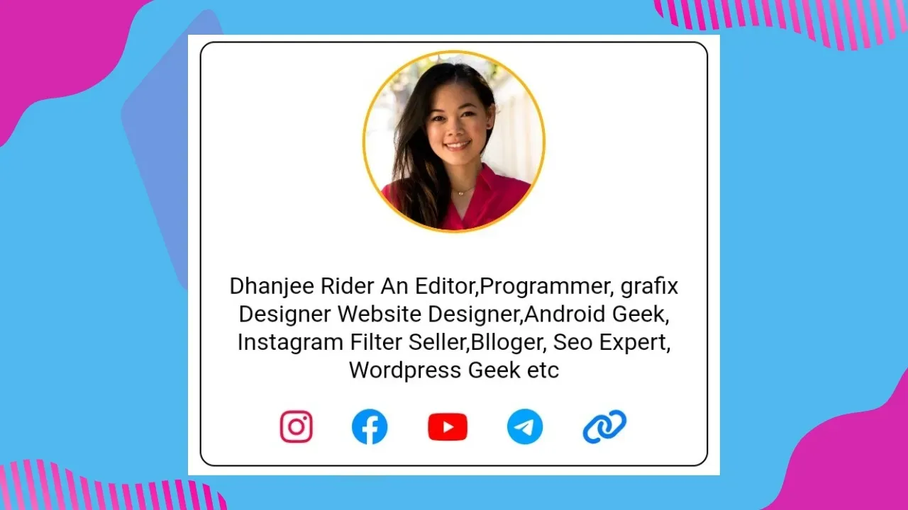
Add styles Hero Section in with social link
If you're a blogger, you know that having a great design can make all the difference. One important design element that can elevate your blog is the hero section. A hero section is a large banner or image that appears at the top of your blog's homepage, showcasing your blog's brand, message, or content.
In this post, we'll cover how to add a hero section in Blogger, the benefits of having one, and some great examples of what a hero section can look like.
How to Add a Hero Section in Blogger
Adding a hero section to your Blogger blog can be done in just a few simple steps:
1. Choose an image or banner:
First, you'll need to choose an image or banner that will be the focus of your hero section. This could be an image of yourself, your blog's logo, or a relevant stock photo.
2. Resize the image
Depending on the size of your blog's layout, you'll want to resize your image to fit the width of your blog. For most Blogger templates, a width of 1000 pixels is a good starting point.
3. Upload the image
Once you've resized your image, upload it to a hosting service such as Imgur or blogger. Then Copy the image URL by clicking on image and then link 🖇️.
4. Add a gadget
In your Blogger dashboard, navigate to the Layout section. Click on "Add a Gadget" and select "HTML/JavaScript".
The code will style your hero section with a centered image, a title and subtitle, and a call-to-action button. You can customize the font sizes, colors, and button styles to match your blog's branding.
A hero section is an excellent opportunity to add a call to action (CTA). A CTA is a message that prompts your visitors to take a specific action, such as signing up for your newsletter or buying your product.
A hero section can provide several benefits for your blog or website, including:Communicating your brand message: A well-designed hero section can help to communicate your brand message quickly and effectively.
Improving user experience: A clear and visually appealing hero section can improve user experience and encourage visitors to stay on your site longer.
Increasing conversions: Adding a call to action to your hero section can help to increase conversions and drive more sales or sign-ups.
Establishing credibility: A professional-looking hero section can help to establish credibility and build trust with your audience.
A hero section is an excellent way to make a strong first impression on your website visitors. By following the steps outlined above, you can create a visually appealing hero section that effectively communicates your brand message and encourages visitors to take action. Remember to continually test and refine your hero section to ensure it is always working effectively for your business.
How to customise Hero Section
Just copy this code and chenge your image and Social link with # that's all
  <div class="tup">


<img class="poc" src="https://www.nicepng.com/png/full/182-1829287_cammy-lin-ux-designer-circle-picture-profile-girl.png" alt="dhanjee rider"> <p class="pilo">Dhanjee Rider An Editor,Programmer, grafix Designer Website Designer,Android Geek, Instagram Filter Seller,Blloger, Seo Expert, Wordpress Geek etc</p>
<div class="icns">

  <a href="#"> <i class="fa-brands fa-instagram" style="color: #ff0040;"></i>
  </a>

  <a href="#"> <i class="fa-brands fa-facebook" style="color: #0090ff;"></i> </a>

   <a href="#">  <i class="fa-brands fa-youtube" style="color: #ff0000;"></i> </a>

    <a href="#">  <i class="fa-brands fa-telegram" style="color: #00a2ff;"></i> </a>

     <a href="#">   <i class="fa-solid fa-link" style="color: #007bff;"></i></a>
</div>


</div>


<style>

   .icns{
       text-align: center;
   }

    .icns a{
        font-size: 25px; padding: 10px;
  text-decoration: none;

  position: relative;
  top: -10px;
    }


    .poc{width: 120px;  border: 2px solid #ffb200;    border-radius: 50%;
display: block;
  margin: 5px auto;
 }
 .pilo{
     padding: 10px; text-align: center;
color: black;
 }
 .tup{

     margin-top: -20px;
  margin-bottom: -20px;
 border-radius: 10px;
 border: 1px solid white;
border: 1px solid black;
padding-top: -50px;

margin: auto;
align-items: center;
justify-content: center; }</style>

<link rel="stylesheet"href="https://site-assets.fontawesome.com/releases/v6.2.1/css/all.css" >
The code will style your hero section with a centered image, a title and subtitle, and a call-to-action button. You can customize the font sizes, colors, and button styles to match your blog's branding.
A hero section is an excellent opportunity to add a call to action (CTA). A CTA is a message that prompts your visitors to take a specific action, such as signing up for your newsletter or buying your product.
Benefits of Adding a Hero Section
A hero section can provide several benefits for your blog or website, including:Communicating your brand message: A well-designed hero section can help to communicate your brand message quickly and effectively.
Improving user experience: A clear and visually appealing hero section can improve user experience and encourage visitors to stay on your site longer.
Increasing conversions: Adding a call to action to your hero section can help to increase conversions and drive more sales or sign-ups.
Establishing credibility: A professional-looking hero section can help to establish credibility and build trust with your audience.
Final Thoughts
A hero section is an excellent way to make a strong first impression on your website visitors. By following the steps outlined above, you can create a visually appealing hero section that effectively communicates your brand message and encourages visitors to take action. Remember to continually test and refine your hero section to ensure it is always working effectively for your business.
Last word
In this post we will provided information about Add styles Hero Section in with social link , If you enjoy this post, kindly share it with your friends. For any queries, feel free to join our Telegram channel, where we share exclusive and informative content. Many valuable tips are exclusively available on our Telegram channel. Stay updated with your favorite source, DK Technozone.


![PUBG Mobile Lite config Ultra Aimbot auto headshot: Latest Update [100% Working]](https://blogger.googleusercontent.com/img/b/R29vZ2xl/AVvXsEhBIxYwXISNcJn0UpDTG0Rg__RYya6j6wgoAfI1V5DMcd9E1uPzYjiJwpvkrjbMa41dpv1zh3VN0bmZ63yisgSuGroWDaIcPS5SbS0iJlworQsR7yEdaZWeOrfrryqf2vo1twZwUp9NE5LYGeCuYs1rPDMW3jGnHbrfd6jKAvmq31sOvK1eT2-Db_S1VrY/s16000/1000113727.webp)


![VegaMovies WordPress Theme v2.0 [ Soft-look]](https://blogger.googleusercontent.com/img/b/R29vZ2xl/AVvXsEgtj4DsFU7AIynwctVX26kWsggi6nylYDadyhV8PoTOyWUU_kQvMriZpwWoEW1_9knbepEjhihxk9UhbO7U-3vTeHv2XIbsMzLx9TXF9f1AoxbTuUehPajFqWeOzaHsJuPJussdjuRyGNSqmMDNQREqahKEjcrtvvGAFxiNh3ky9sjUCRYY0zm8lK9gJcw/s16000/1000098739.png)
